Onto
Taking dusty academic theories & concepts off the shelf and catapulting them into a fresh, new modern interface. This project formed part of an MSc in Climate Change, offering a rare opportunity to express creativity in a literature-dense & structure-heavy space
Skills:
New product conceptualisation, UX+UI, Branding
Crafted with:
Figma, Unsplash, Mockup Plugin, Previewed
Preview:
Date:
2022
'Bringing colour to academia' This became the tagline and the rallying call for designing a new product concept
As part of my MSc in Climate Change, I undertook a module on education where we were tasked with creating an educational intervention that could effectively communicate aspects of climate change to engage a particular audience. In my experience, much academic literature can seem lofty, dusty, old fashioned or out of touch. The opportunity thus presented- how to lift academic theories off the proverbial dusty shelf, and inject new life into them, repackaging for a new, younger audience who may be more accustomed to engaging with content in a more fluid & dynamic digital way.


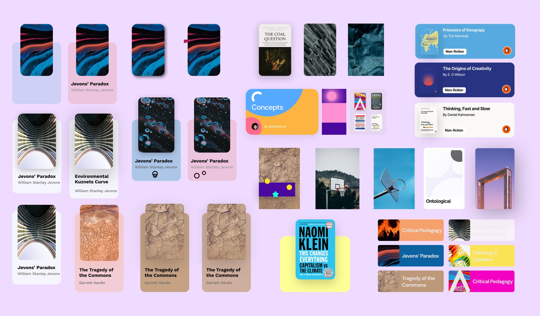
Drawing inspiration from popular content & media streaming platforms, I was compelled to design a Spotifyesque platform for climate change related concepts, theories, and books. I wanted to create something fresh & engaging with bright colours & striking visuals, playing with shape & form in order to showcase theories and concepts in a new light. Although a given theory may be over 150 years old, it can still be relevant today, and I wanted to show that relevance. Another primary motivation was in breaking down knowledge silos. How could I demonstrate that given theories & concepts may be related to one another, such that understanding these links helps to build greater knowledge
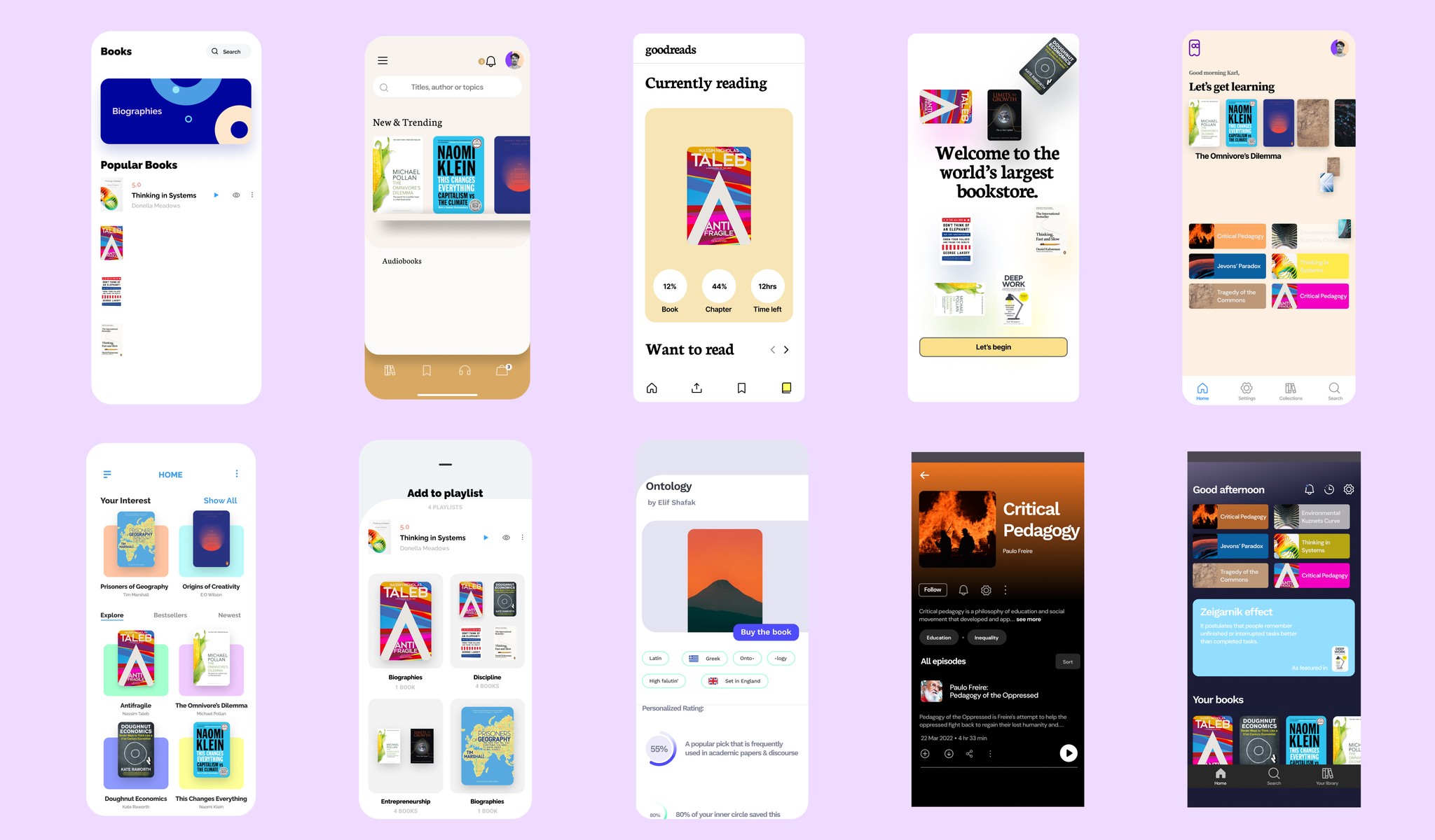
A big challenge was in how to visually represent a given theory or concept, which can be quite abstract & nebulous by nature. I also needed a way to show links between different concepts, and how they relate to one another. I believed it was also very important to craft a visual aesthetic & a basic brand identity that matched the vision for the product. This required much experimentation & sampling of numerous real & conceptual products. On a technical level- designing the 2-way scrolling features for content browsing & discovery (both vertical & horizontal scrolling capabilities) was a challenge.
Discover & learn about theories & books with a content-streaming inspired concept app
To align with the vision for the product, I adopted a visually abstract, fresh, modern look. I sought to blend function with form, understanding the space, offering discoverability.
In order to bring the product to life for the presentation, I added in some prototyping capabilities to demonstrate scrolling & browsing.