A Dissertation Deconstructed
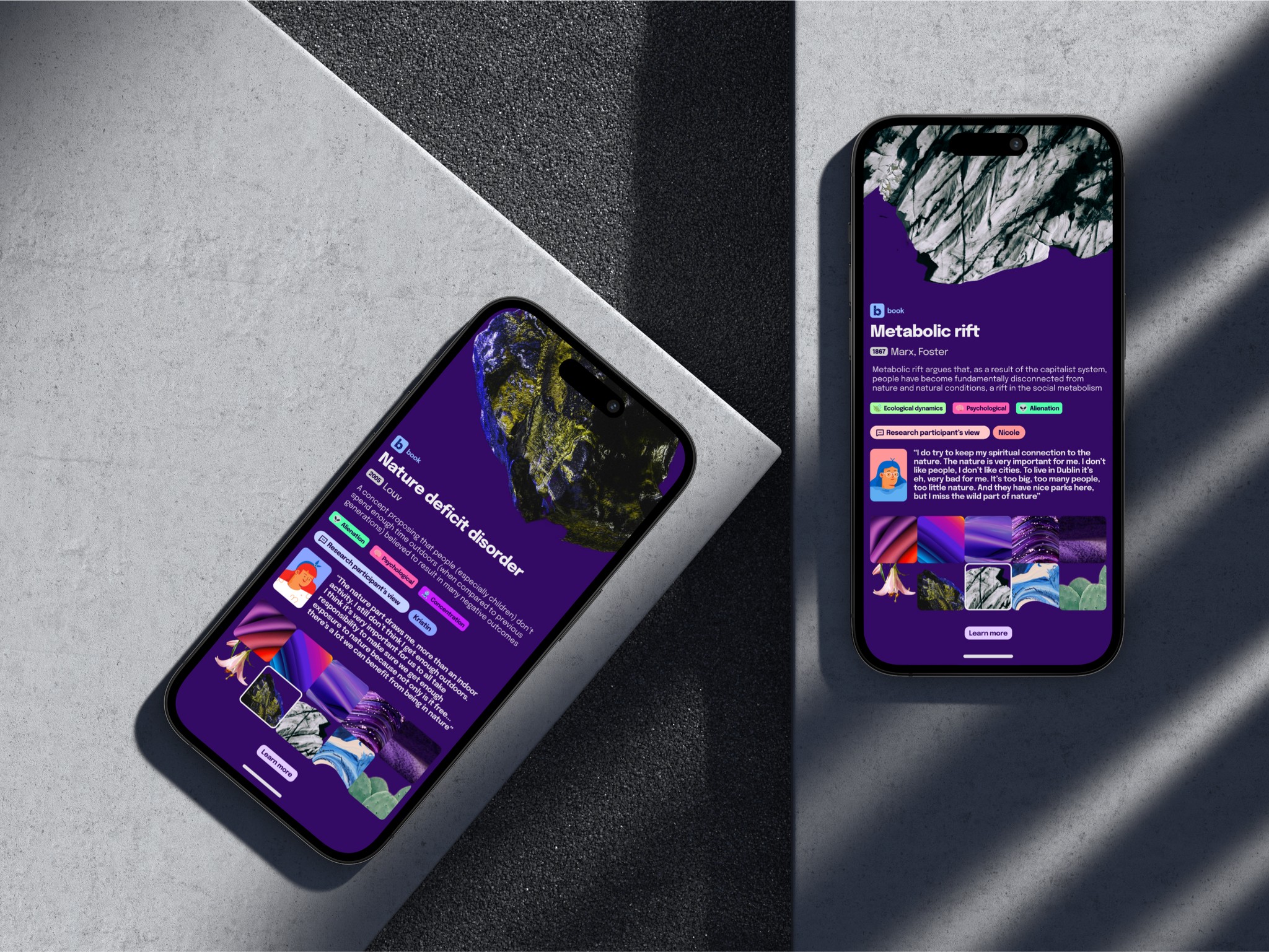
No one is gonna read your dissertation. This slowly dawning realisation became the motivation for conceptualising how I might present the choicest concepts, theories & quotes encountered during my Masters research project, in a more tangible, more relatable, and more eye-friendly way. This is the result
Skills:
New product conceptualisation, UX+UI, Branding
Crafted with:
Preview:
TBC
Date:
2024
The reality is- no one is gonna read your dissertation
We put so much thought, time and energy into these dissertations (and I'm talking Masters level here, not even a PhD thesis) but rarely receive the validation or appreciation we so desperately want (or maybe that's just me projecting 😄)
14,965 words. That's the final output. And this is following a fairly grueling process of editing down from 20,000+ at times (as there was a very strict word count of 15K). So the question is- who is actually gonna read that? As much as a lot of us would love to share our hard-earned findings with the world and get the feedback we crave, the reality is that very few folks will have the time (let alone the motivation) to pore over a wall of words such as this
A screen recording of a scroll through of the c. 15,000 word (47 page) dissertation document, complete with 80+ references
How might I design something that communicates the essence of my dissertation, and which doesn't bore people to tears
You often hear it said that a good sign of understanding something well is being able to describe it simply & clearly. Therein lay the challenge(s).
Part 1- of all the academic literature that I encountered on the topic of people's relationship with nature, I wanted to select a Top 10 of the choicest cuts- the ones that resonated most strongly, the ones that most closely aligned with the experiences of the people I interviewed, in their own words.
Part 2- can I package these insights into a format that attracts attention, engages, and informs in a more palatable & easily digestible way.
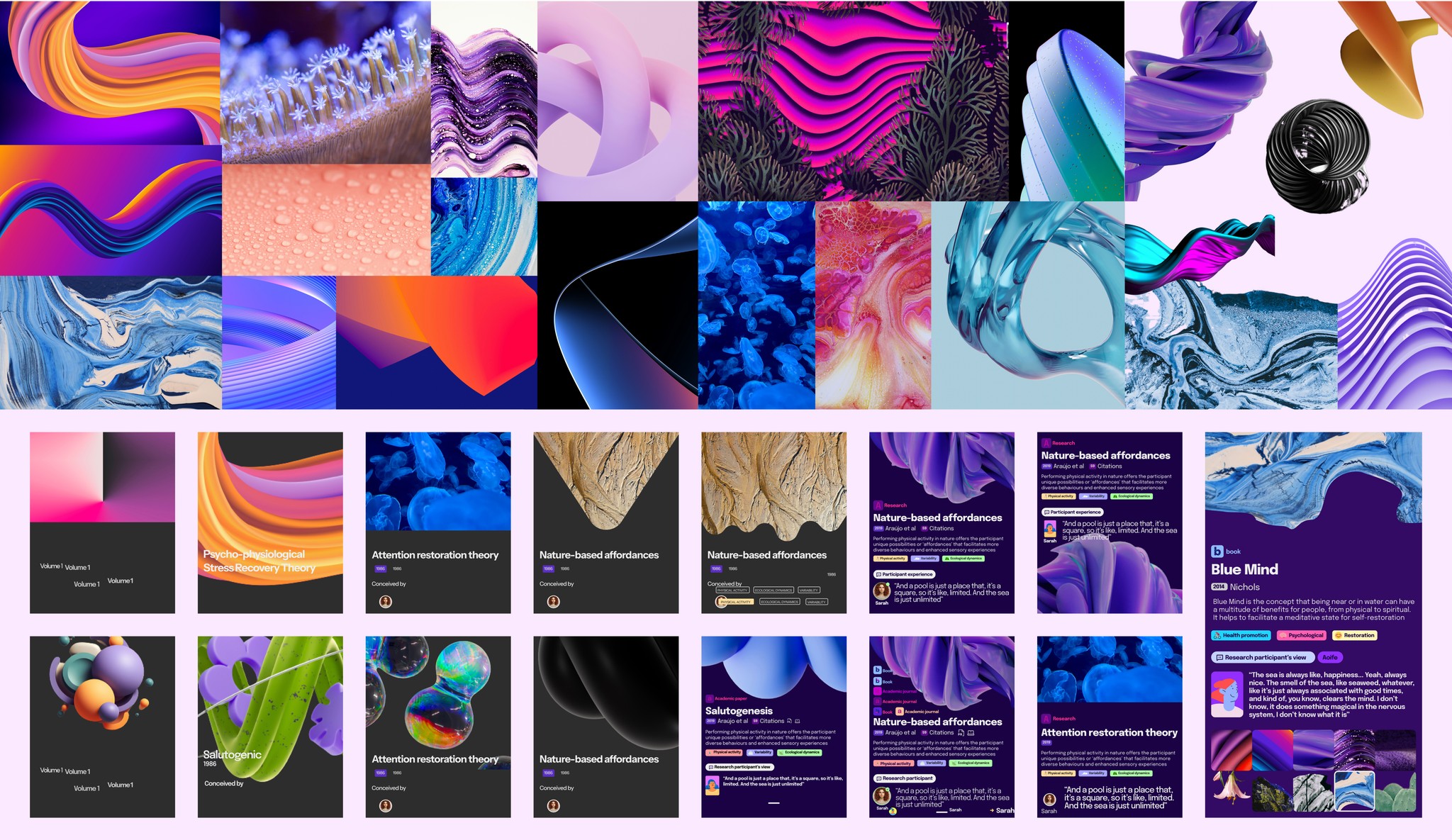
Design Speed Run Part 1: Looking at initial inspiration and early iterations of the card designs
Net flicks and distill
For inspiration, it was not for the first time I looked to where our attention is held (grabbed, even). The media streaming behemoths like Spotify and Netflix that visually engage and draw us in with their slick interfaces, flexing their dark backgrounds, strong contrasts, popping tags, and abstract visual storytelling, became a strong focal reference point. These soon became the template for what I wanted to create, and how I wanted to convey the concepts and theories I found most interesting during my research. As the old saying goes, "If you can't beat 'em, JPEG 'em".
In tandem, early on I needed to Identify a visual basis, a distinctive visual language that could help to convey the meaning of relatively nebulous concepts, theories, and hypotheses centered around human-natural world interactions. This eventually manifested as physical forms or abstract (sometimes three dimensional) shapes, contours, natural elements & features. Sourcing these images, and aligning them as closely with the particular concept as possible, was a lengthy process.

Abstractions becoming reality: Collated early visual inspiration forms the basis for card designs conveying abstract theories & concepts
Reduce Reuse Recycle: Components variety
In terms of the more technical challenges (and opportunities) that arose during the design process, much of this revolved around leveraging the scaling capabilities of Figma. For instance, when the card design was finalised I then reverse-engineered it, re-building from scratch in order to incorporate the flexibility of Components, Component Properties, and Auto-Layout. This allowed me to work from a Master template, which could then be tailored in a multitude of different ways. This process involved broadening my understanding of new modular features (through a number of tutorials and subsequent trial & error) and figuring out how they could be integrated into the card design.
Once completed, the remaining challenges focused on how to animate sequences to bring the concepts to life in formats that could be shared across platforms. This necessitated the use of Frames and Smart Animate features, where the incorporation of motion enhances storytelling.
"Karl, you have made a perfect salutogenesised-biophilic-metabolics of this - well done!!"
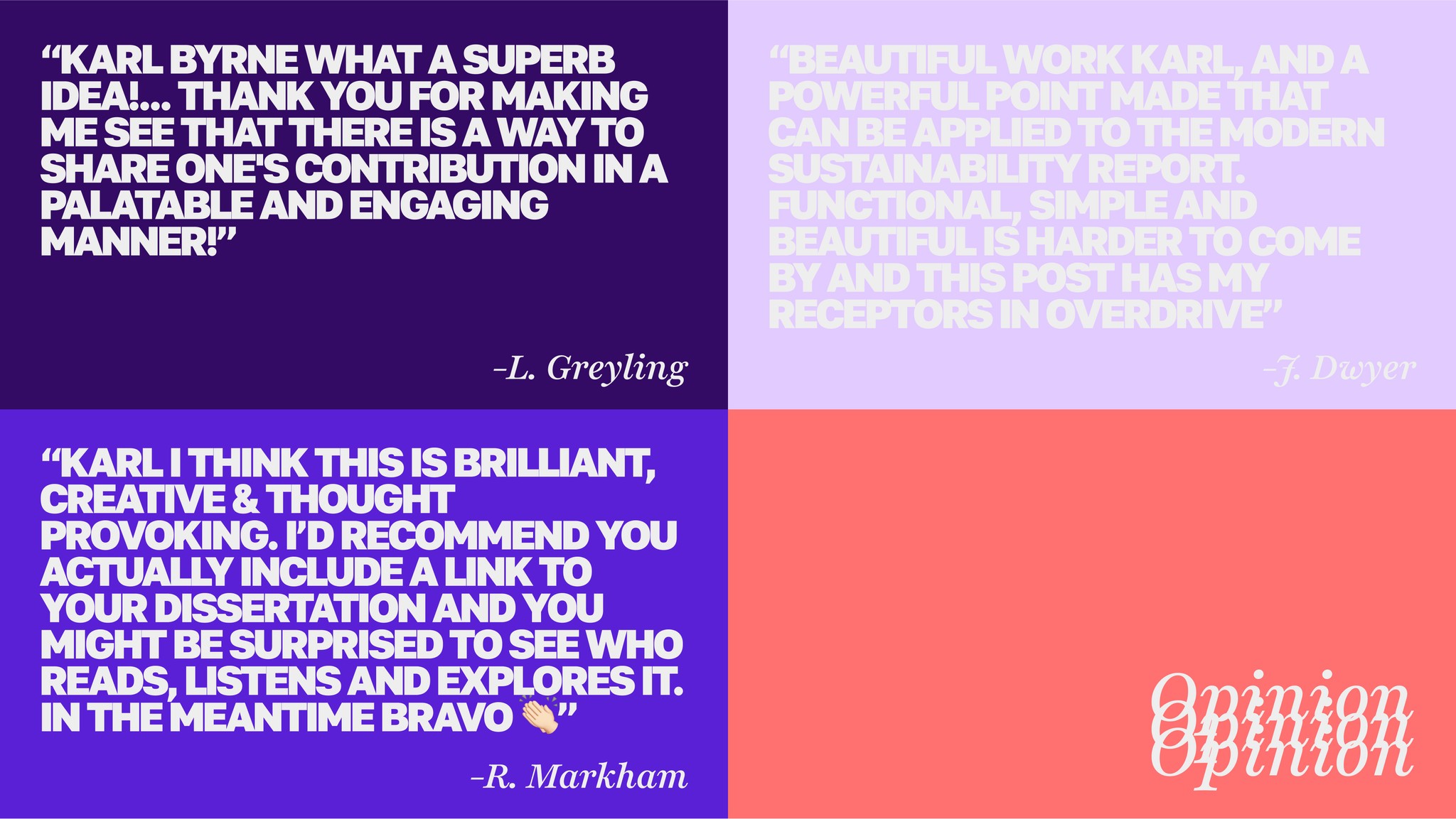
After some deliberation I put together a post on LinkedIn to showcase the project. I don't know what my expectations were but I certainly hoped it would be received well, hoped that the concept would resonate, hoped that it would get in front of folks who could relate. In the grand scheme of social media tings it's not a lot of engagement, but in the context of my platform and my post history it was significant. The numbers, as of Jan '25; 18K impressions, 153 reactions, 40 comments (nearly half of which are mine), and the figure that I was probably most pleased with- 11 reposts. Below is a selection of the comments.

