Text and Click
A personal project with the aim to reinvigorate my design portfolio. An effort to showcase my design identity and to refine new digital skills, leveraging Figma's Auto-layout, breakpoints, and prototyping to tell a distinctive story
Skills:
New product conceptualisation, UX+UI, Branding
Crafted with:
Figma, Growwwit, Mockup Plugin
Preview:
Date:
2023
Knowing my portfolio needed a big refresh, I used the chance to also level up some Figma skills
How to create a visual elevator pitch? That was part of my motivation as I set out to design an eye-catching, engaging & illustrative hero section for my portfolio website, that also reflects my identity as a designer. The challenge evolved to encompass how to build a refreshed personal brand identity, and more broadly, how to position myself for my ideal role. This project offered an opportunity for me to get clearer on what direction I want to go as a designer. It offered a space to explore & experiment with different aspects of my work- both from my identity as a designer, to the types of products & experiences I want to be designing.


Challenges presented themselves around understanding some of Figma's new features, aspects of auto-layout, components and variants. Utilising breakpoints and better understanding responsiveness, particularly when it came to card components. It made me start thinking more in terms of reusable and reproducible components, and not just standalone elements. Having said that, I was also curious as to how to build elements from the ground up, expanding my thinking to integrate more scalable components.
As I was the focus of my own project, the approach involved a lot of introspection & naval gazing- clicking the belly button in order to uncover user insights. Asking myself questions such as- "How do I perceive myself and how do I want to be perceived as a design professional?", "How do I visually and conceptually bring together my work in design & UX, together with that from my areas of study in climate & sustainability?", "What can I create that I'd be proud to stand over and feature on my portfolio website?".
Who am I? (as a digital designer) is the main question that guided the creative process for this project
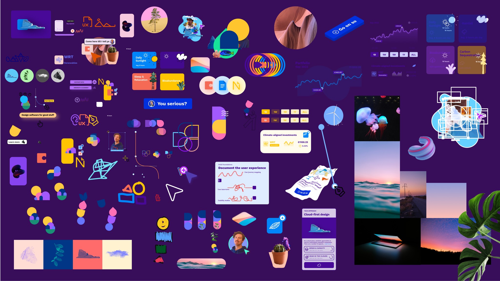
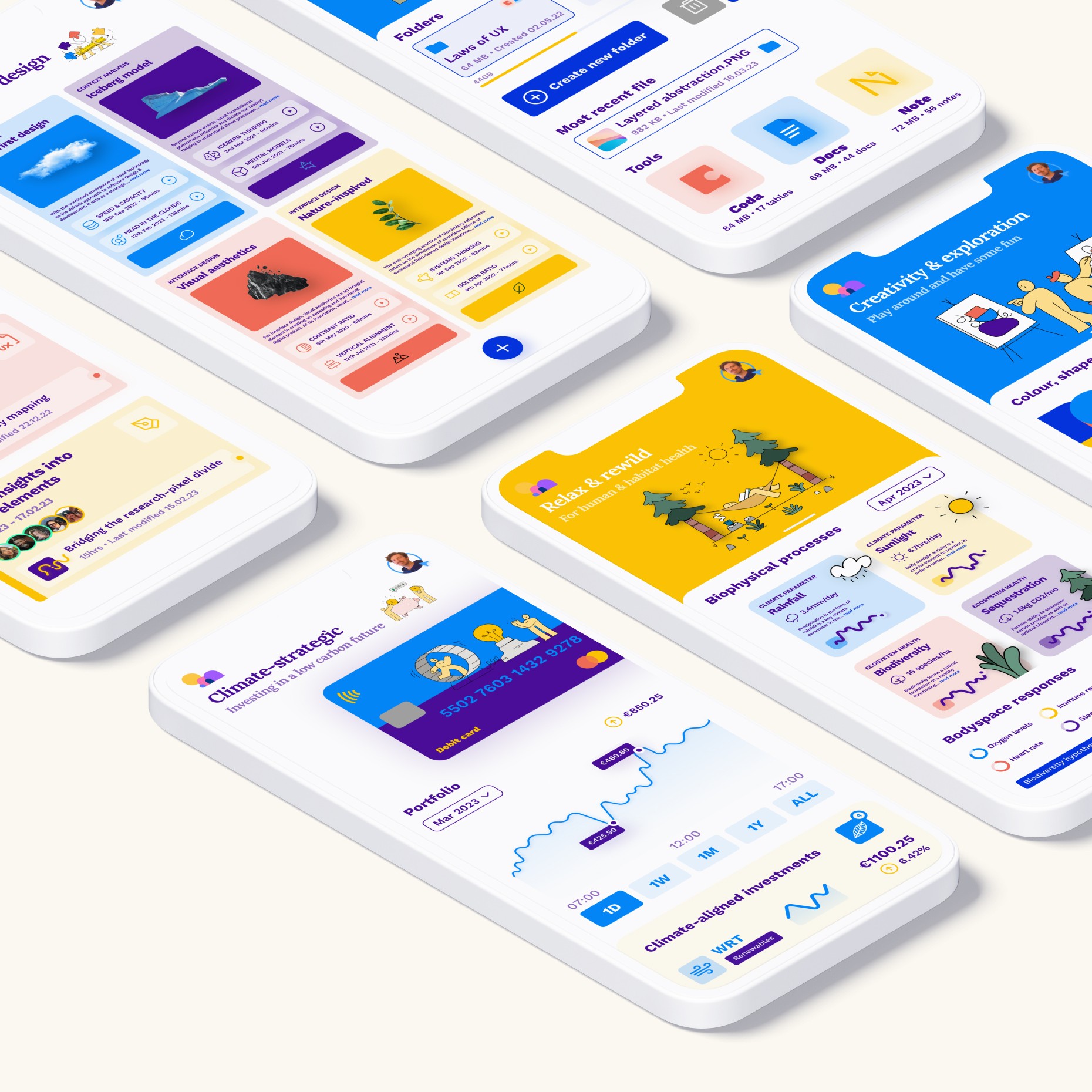
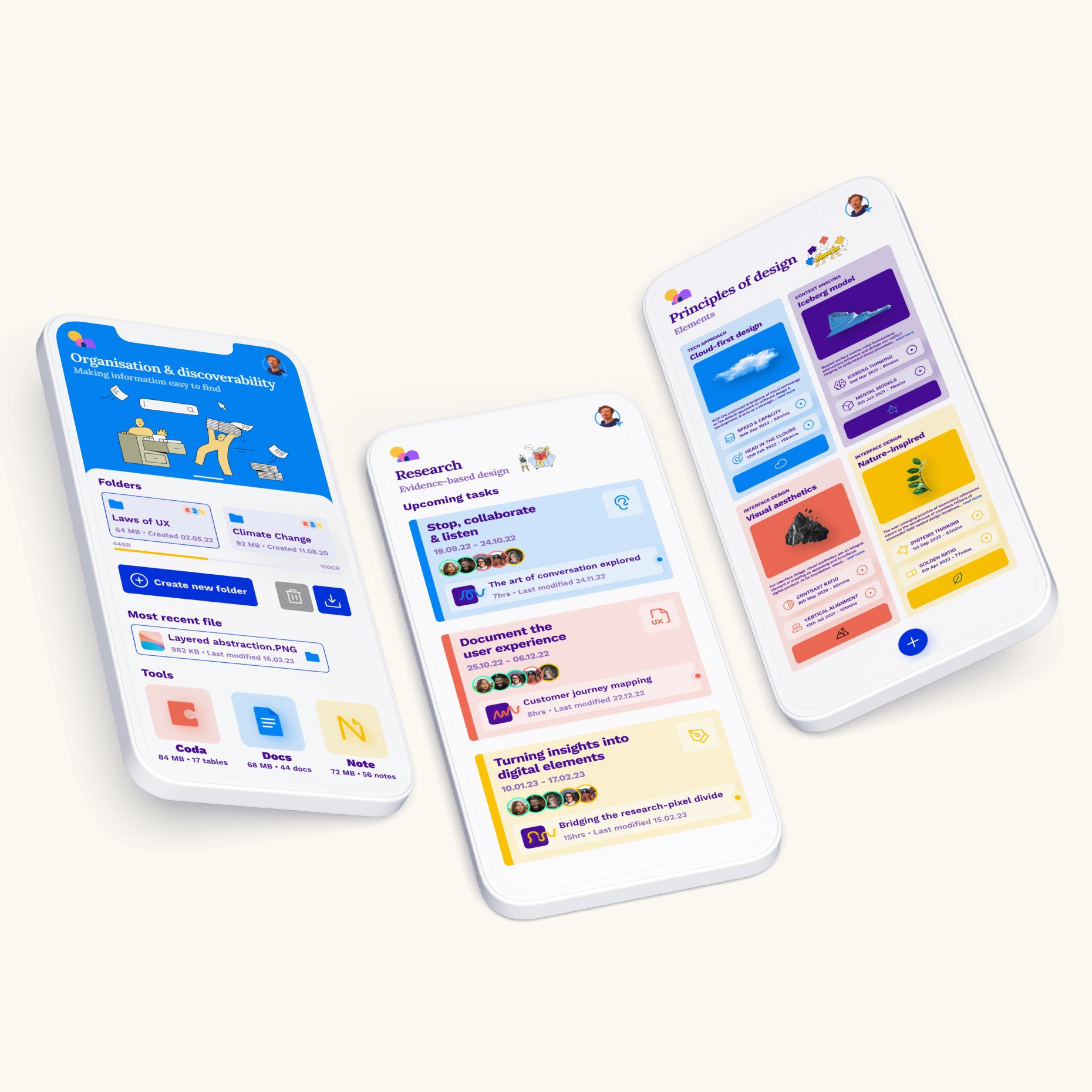
For the final design, each screen represents a different aspect of my interests, principles, aesthetic sensibilities, what's most pertinent in my design processes, typography, colour palette, and graphics preferences.
The final animation you see on the homepage shows how I'm pulling together all these different aspects of my interests, principles and ideals, into one digital product prototype.